The top-level API of GPUI cannot implement a feature-rich circular progress bar. Of course, a simple circular loading ring can be implemented very easily, such as using SVG elements and then adding SVG rotation animations.
That thing:
But when adding a progress value to this circular loading ring, the above solution is somewhat inadequate (unless you want to prepare 100 SVG elements and then set the display of SVG elements based on the progress value).
The best approach is to use the canvas API. Moreover, we cannot implement this component from Render or RenderOnce, but instead implement it from the lower-level Element.
The relationship between them is roughly like this:
graph TD
    A[Element] --> B[RenderOnce]
    B --> C[Render]

    A1[Basic element features] --> A
    B1[Single render] --> B
    C1[Mutable state rendering] --> C

    D[Lowest level] --> A
    E[Middle level] --> B
    F[Highest level] --> C
Design
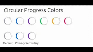
We want to implement support for 2 modes. When no progress value is added, the default is a 1/4 circular loading ring with a rotation animation (like the animation in the image above). When a progress value is added, it displays the progress value.
// Mode 1: Rotation animation (default)
CircularProgress::new()  // Shows a rotating 90-degree arc

// Mode 2: Progress display
CircularProgress::new().value(0.75)  // Shows 75% progress
This design allows a single component to satisfy two different use cases, avoiding the complexity of creating multiple similar components.
Graphics Drawing
When there is no progress bar, it’s a rotating 1/4 ring with rounded ends. We can implement this using canvas path drawing.
fn draw_thick_quarter_arc(
    x: Pixels,
    y: Pixels,
    radius: Pixels,
    rotation_angle: f32,
) -> Path<Pixels> {
    let center = point(x, y);
    let mut builder = PathBuilder::stroke(px(4.0)).with_style(PathStyle::Stroke(
        StrokeOptions::default()
            .with_line_cap(lyon_path::LineCap::Round)
            .with_line_width(4.0),
    ));

    // Calculate the rotated starting point
    let start_angle = rotation_angle.to_radians();
    let start_x = center.x + radius * start_angle.cos();
    let start_y = center.y + radius * start_angle.sin();

    // Move to the rotated starting point
    builder.move_to(point(start_x, start_y));

    // Calculate the rotated ending point (90-degree arc)
    let end_angle = (rotation_angle + 90.0).to_radians();
    let end_x = center.x + radius * end_angle.cos();
    let end_y = center.y + radius * end_angle.sin();

    // Draw the 90-degree arc
    builder.arc_to(
        point(radius, radius),
        px(0.0),
        false, // small arc
        true,  // clockwise
        point(end_x, end_y),
    );

    builder.build().unwrap() // Build the path
}
The key points are using with_line_cap to achieve rounded ends, using with_line_width to control ring thickness, and using arc_to to create the arc.
When there is a progress bar, we need to control the arc degree of the ring based on the progress value. So we need to convert the progress value from 0-1 to degrees 0-360.
    // Calculate the angle corresponding to progress (360 degrees * progress value)
    let progress_angle = 360.0 * progress.clamp(0.0, 1.0);
Since the arc is implemented using the arc_to method, we need to know the start point, end point, and rotation angle of the arc. Generally, we take the 12 o’clock direction as 0 degrees and increase clockwise.
So the starting point is:
    // Fixed starting angle at -90 degrees (starting from 12 o'clock direction)
    let start_angle: f32 = -90.0;
    let start_x = center.x + radius * start_angle.to_radians().cos();
    let start_y = center.y + radius * start_angle.to_radians().sin();
The ending point is:
    // Calculate the ending point
    let end_angle = start_angle + progress_angle;
    let end_x = center.x + radius * end_angle.to_radians().cos();
    let end_y = center.y + radius * end_angle.to_radians().sin();
The overall code is as follows:
// Add new drawing function
fn draw_progress_arc(
    x: Pixels,
    y: Pixels,
    radius: Pixels,
    progress: f32, // Progress value, range 0.0 to 1.0
) -> Path<Pixels> {
    let center = point(x, y);
    let mut builder = PathBuilder::stroke(px(4.0)).with_style(PathStyle::Stroke(
        StrokeOptions::default()
            .with_line_cap(lyon_path::LineCap::Round)
            .with_line_width(4.0),
    ));

    // Calculate the angle corresponding to progress (360 degrees * progress value)
    let progress_angle = 360.0 * progress.clamp(0.0, 1.0);

    // Fixed starting angle at -90 degrees (starting from 12 o'clock direction)
    let start_angle: f32 = -90.0;
    let start_x = center.x + radius * start_angle.to_radians().cos();
    let start_y = center.y + radius * start_angle.to_radians().sin();

    // Move to starting point
    builder.move_to(point(start_x, start_y));

    // Calculate the ending point
    let end_angle = start_angle + progress_angle;
    let end_x = center.x + radius * end_angle.to_radians().cos();
    let end_y = center.y + radius * end_angle.to_radians().sin();

    // Draw the progress arc
    builder.arc_to(
        point(radius, radius),
        px(0.0),
        progress_angle > 180.0, // Use large arc when angle is greater than 180 degrees
        true,                   // clockwise
        point(end_x, end_y),
    );

    builder.build().unwrap()
}
Mainly using trigonometric functions to accurately calculate the arc position.
Text Rendering
When displaying specific progress, the component displays a percentage text at the center of the circle:
// Display percentage value at center of circle
if let Some(value) = self.value {
    let percentage_text = format!("{:.0}%", value * 100.0);

    // Precise text centering calculation
    let text_width = shaped_line.width;
    let text_height = font_size * 1.2;
    let text_start_x = text_center_x - text_width / 2.0;
    let text_start_y = text_center_y - text_height / 2.0;

    // Use GPUI text system to render
    let _ = shaped_line.paint(text_origin, font_size, window, _cx);
}
Animation System
We need an animation state manager to manage the state of the animation.
// Animation state structure
#[derive(Clone)]
struct AnimationState {
    start: Instant,
    rotation_angle: f32,
}
The component uses GPUI’s element state management to implement smooth animations:
fn request_layout(
        &mut self,
        global_id: Option<&GlobalElementId>,
        _local_id: Option<&InspectorElementId>,
        window: &mut Window,
        cx: &mut App,
    ) -> (LayoutId, Self::RequestLayoutState) {
        // Use gpui's element state management to ensure animation continues running
        if let Some(global_id) = global_id {
            window.with_element_state(global_id, |state, window| {
                let mut state = state.unwrap_or_else(|| AnimationState {
                    start: Instant::now(),
                    rotation_angle: 0.0,
                });

                // Update rotation angle
                let now = Instant::now();
                let delta = now.duration_since(state.start).as_secs_f32();
                state.rotation_angle = (delta * 360.0/*rotate 360 degrees per second*/) % 360.0;

                // Update component's rotation angle
                self.rotation_angle = state.rotation_angle;

                let (circular_size, _stroke_width) = self.size.get_size();

                // If there's a label, need additional height space
                let total_height = if self.label.is_some() {
                    circular_size + 25.0 // label height
                } else {
                    circular_size
                };

                // Create style
                let style = Style {
                    size: Size::new(px(circular_size).into(), px(total_height).into()),
                    ..Default::default()
                };

                // Return layout ID and state
                let layout_id = window.request_layout(style, None, cx);

                // Request next frame animation
                window.request_animation_frame();

                ((layout_id, ()), state)
            })
        } else {
            // If no global ID, use simple implementation
            let now = Instant::now();
            if let Some(last_update) = self.last_update {
                let delta = now.duration_since(last_update).as_secs_f32();
                self.rotation_angle = (self.rotation_angle + delta * 180.0) % 360.0;
            }
            self.last_update = Some(now);

            let (circular_size, _stroke_width) = self.size.get_size();

            // Create style
            let style = Style {
                size: Size::new(px(circular_size).into(), px(circular_size).into()),
                ..Default::default()
            };

            let layout_id = window.request_layout(style, None, cx);
            window.request_animation_frame();

            (layout_id, ())
        }
    }
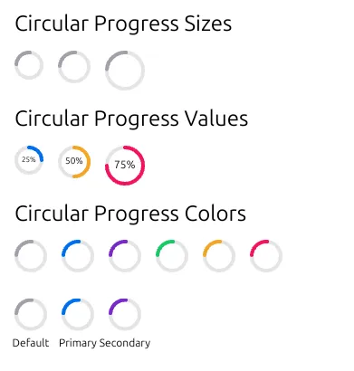
The final result is as follows: